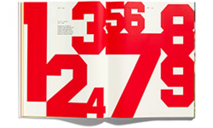
Our old pals at Spiel Magazine have been so kind as to let us resurface an article from their latest edition: FOOTBALL + VISUAL CULTURE, as they caught up with designer and Football Type author Rick Banks.
Would you rather endure bad football or bad typography?
Well, after supporting Bolton Wanderers for 28 years I’ve had to endure both. But if push came to shove I’d much rather watch 90 minutes of the beautiful game. Typography has a long association with football.
How much does this form a ‘football type’ tradition?
In 1992, when commercialisation exploded in football, the Premier League launched shirt names to accompany the standard number. This was a smart marketing move by the Premier League, as fans could now pay for the privilege of having their idol’s name - or indeed their own - printed on their expensive replica shirts. Obviously, this increased revenue for football clubs. Football lettering today is big business.
More clubs are commissioning bespoke, experimental lettering, and spending millions building a strong visual identity that can be used on merchandise and communications. They are creating brand identities for themselves which makes them stand out. For example, Tottenham approached an agency to look at their brand and identity. The agency re-drew their logo/crest making it modern and clean and commissioned a typographer to draw a distinctive font. This font features in all their communications and is all over the stadium.
When fans go to the club shop to buy a shirt, they have the choice between the Premier League lettering or Tottenham’s own font.
Are there any instances of football type which have stood out to you?
For me, the most successful shirts are when they have considered and complimentary typography. For example, Real Madrid’s 2011 gold optical font which was designed by Anthony Barnett at Sporting iD. The gold optical lettering not only looked good but it matched the shirt’s gold trim. All good design has a story behind it and Anthony’s was no different in that it paid homage to iconic players of Real Madrid’s past, like the peerless Argentinian match-winner Alfredo di Stefano.
Paul Barnes’ duotone lettering for England in 2012 is another beautiful example. His use of two different reds had never been done before and was very memorable.

Football audiences are (in general) not design educated, does this factor when designing for a football?
I think football writer, Sheridan Bird sums it up well in ‘Football Type’: “‘At the end of the day, names and numbers are for identifying players,’ is the understandable refrain of the average fan...but their creativity adds beauty to function and makes the journey aesthetically pleasing. Footballers have to wear numbers, why not make them eye-catching, meaningful and unique?”
I was obsessed with the small details of the football world as a young kid and I think many people are too - not just designers. God is in the details and good design makes the world a better place to live in.
Is the football shirt a viable medium for typographic expression?
I think it’s a fantastic opportunity for typographic expression. It’s a blank canvas that will be seen by millions.
Do you see any similarities between design practice and football?
Good design and good ideas are often down to sheer hard work. It’s no fluke why Ronaldo’s free kicks go in the top corner. He has trained and trained and worked on them over and over again. Luck is the interaction between hard work and opportunity.
Typefaces are often the only ‘brand’ element on a football kit (team badge, colours etc are usually boxed off) - how do brands instruct design?
I disagree that the typeface is only brand element for a football club. Going back to Tottenham’s identity. They cleverly saw the club as a modern brand and built brand assets like you would with any big brand: Logo (crest), Typeface, Colour, and Tone of Voice. So when you see Tottenham play you will be constantly bombarded with their brand. Their blue cockerel logo. Their distinctive blue lettering on the back of their shirts (in Europe).
And even their ‘to dare is to do’ tone of voice on the banners all around White Hart Lane. They even have sub-branded products like ‘Spurs TV’. At the end of the day football clubs are brands. And like many big brands, they are commissioning bespoke typefaces more and more.
A bespoke font gives a brand an ownable, unique asset. It makes them stand out above the competition. They can become as iconic as logos themselves. It is a badge of distinction and a bold statement of individuality.
Rick Banks is the founder and owner of Face37. More of Rick’s type can be seen in the latest issue of SPIEL, available from here.